
Streamlining Functionality to Boost User Flow and Conversions
Problem
The website had disorganized, unprioritized content, making navigation difficult and reducing user engagement.
Solution
Streamlined the homepage, improved content hierarchy, and enhanced navigation for easier access to key information.
Tools
Figma
Invision
Adobe Illustrator
Qualtrics
My role
UI Designer
UX Researcher
UX Designer


Research and analysis
Brand Discovery
-
Researched the company's unique elements, values, and attributes.
-
Explored their identity, target audience, market positioning, and overall brand essence.
-
Identified the brand’s personality, values, and key messages it wants to convey.
-
Goal: Gain a comprehensive understanding to inform brand development, messaging, and communication strategies.
Goals
-
Primary services include:
-
Packing, shifting, and moving belongings.
-
Offering shifting and moving consultation.
-
Apartment, office, residential, and long-distance shifting services.
-
Two types of shifting services
-
-
Local moves.
-
Special offer for students to settle before the semester starts
-
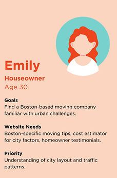
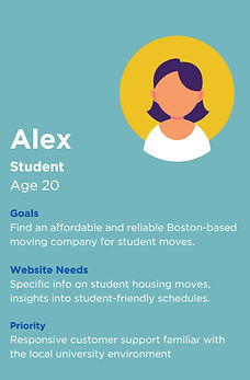
User Personas

Competitive Analysis findings
By incorporating the insights from these personas into the strategies, we created a more personalized and effective experience for the customers, ultimately increasing customer satisfaction and loyalty.
1
Prioritize clean and modern design, visible calls-to-action.
2
Emphasize engaging visuals, transparent pricing information
3
Highlight a diverse range of services, incorporate client testimonials.
4
Consider interactive features, emphasize local expertise.
Site mapping and Content breakdown
After analysis and user research, we prioritized content and established a clear hierarchy for better navigation and user experience. Using various personas, we crafted a sitemap addressing key pain points, which guided the content wireframes and webpage redesign.
The content is divided into two parts
-
Page templates
-
Content Breakdown
Click on the tab to know the contents of each page
Page templates
0.0 Home Template
-
CTA (Get a Quote) with Company Description
-
Icons for 8 Services with "Know More" Button
-
Display of Company Awards as Logos
-
Key Stats: Clients, Years in Business, Satisfaction Percentage
-
Customer Testimonial with Star Ratings
-
Additional CTA (Get a Quote)
-
Company Info and Staff Image Section
-
Company Affiliations and Logos with CTA to Call or Get a Quote
Click on the tab to know the contents of each page
Content Breakdown (In detail)
0.0 Home Content Breakdown
-
Starts with a CTA (Get a Quote) on the right and a brief company description on the left.
-
Icons representing 8 services below, each linking to the services page, with a "Know More" button for more details.
-
Company awards displayed as logos.
-
Section showing three key stats: number of clients, years in business, and customer satisfaction percentage.
-
Customer testimonial in the center with star ratings.
-
Another CTA for getting a quote.
-
Section with text about the company on the left and a company staff image on the right.
-
Company affiliations shown as a small text box with logos of affiliated companies, followed by a CTA to call or get a quote.
Sketches, Low & High fidelity Wireframes
After outlining the website structure, I sketched and illustrated the design to capture the envisioned look and feel. The focus was on enhancing user experience while preserving the brand's essence and maintaining continuity with the original design.
HOMEPAGE
.jpeg)
.jpeg)
.jpeg)
.jpeg)
.jpeg)
.jpeg)
ABOUT PAGE
SERVICES PAGE
PRICES PAGE
REVIEWS PAGE
CONTACT PAGE
Low Fidelity Desktop wireframes
Here are the low-fidelity wireframes for each page, design changes and their rationale are outlined at the top of each wireframe for clarity and improvement.
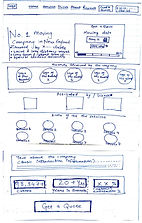
Home page
The initial homepage wireframes featured full-width text detailing services. I redesigned it to present information more visually and categorize it clearly, making it easier for users to understand the company's offerings.
Mobile

Desktop
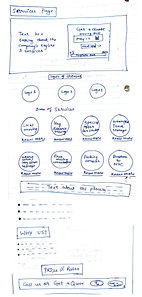
Service page
The goal was to streamline service information. The original text-heavy page was reorganized with icons and illustrations for a more concise and visually appealing layout.
Desktop

Mobile

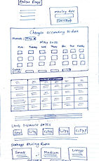
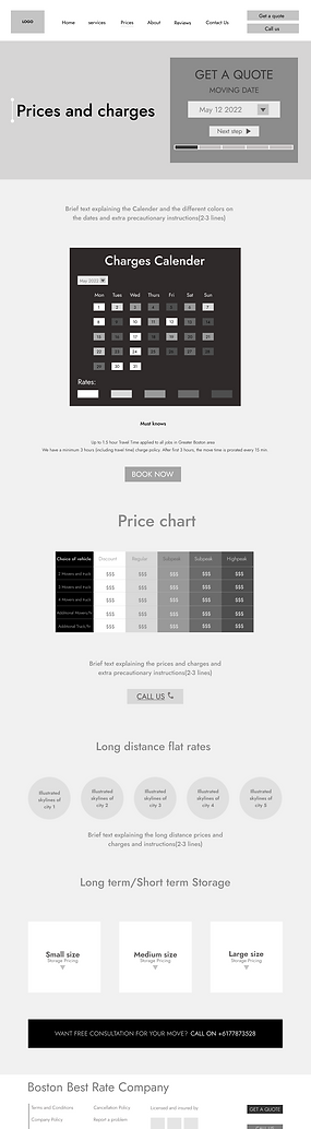
Prices page
The page aimed to categorize services and display prices efficiently. It featured a calendar showing moving rates and fees, with a table detailing costs for each rate.
Mobile

Desktop
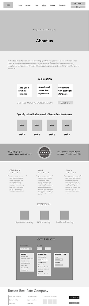
About page
The original website had two pages with overlapping content. These pages were combined, and the content hierarchy was adjusted to place the most crucial information at the top.
Desktop
Mobile

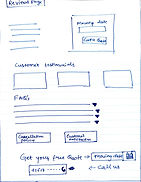
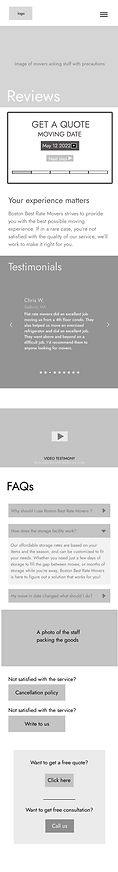
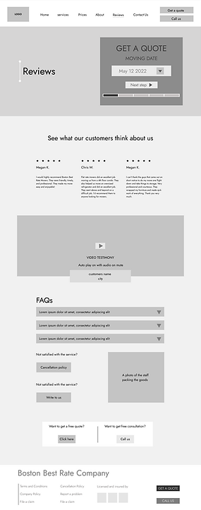
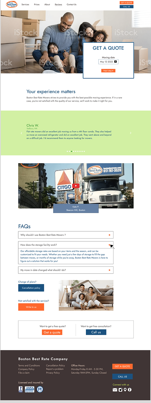
Reviews page
The original website lacked a reviews page and had important, hard-to-find content on internal pages. This new page consolidates essential information, including cancellation policies, late fees, date changes, company policies, and general FAQs.
Mobile
Desktop
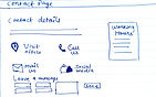
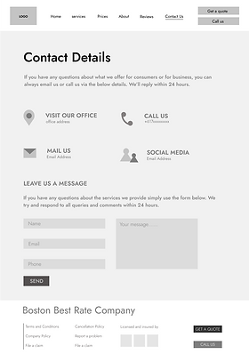
Contact page
The original website lacked a contact page. In the redesign, we added a contact page to facilitate customer inquiries and provide easy access to company contact details.
Desktop
Mobile

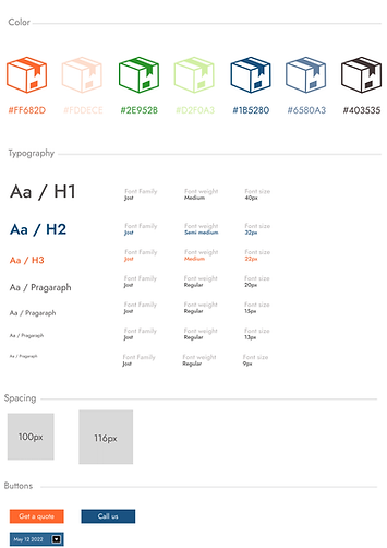
Visual Style Guide
To create the high-fidelity wireframes, we developed a visual style guide detailing logo usage, color palette, typography, and layout.
This guide ensures brand consistency and a unified identity. We retained the brand's color palette of blue and orange and selected fonts based on our target audience's preferences for an engaging user experience.
High Fidelity Mobile Wireframes
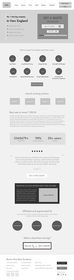
Homepage
Mobile

Desktop

A small quote with a CTA to see the prices of the services.
<
_________
Added a prominent, brightly colored CTA form for quotes at the top of the website to attract attention and drive conversions.
<
________
Added a breakdown of the moving process into four easy steps to clarify what the company will do for the customer.
<
____________
Wrote a small copy to give a small history of the company and their customer base
<
____________
<
____________
A testimonial praising the company’s excellent services.
This section outlines the company’s services with a CTA to explore all details.
<
__________
<
____________
A comparison showing the company offers the best prices for top-quality moving services in Boston.
This section details the company’s history and origin story.
<
_________
Statistics about the company which establishes trust.
<
_________
Introducing the staff and concluded with the company's authenticity and CTA to convert.
<
_________
Services page
Mobile

Desktop
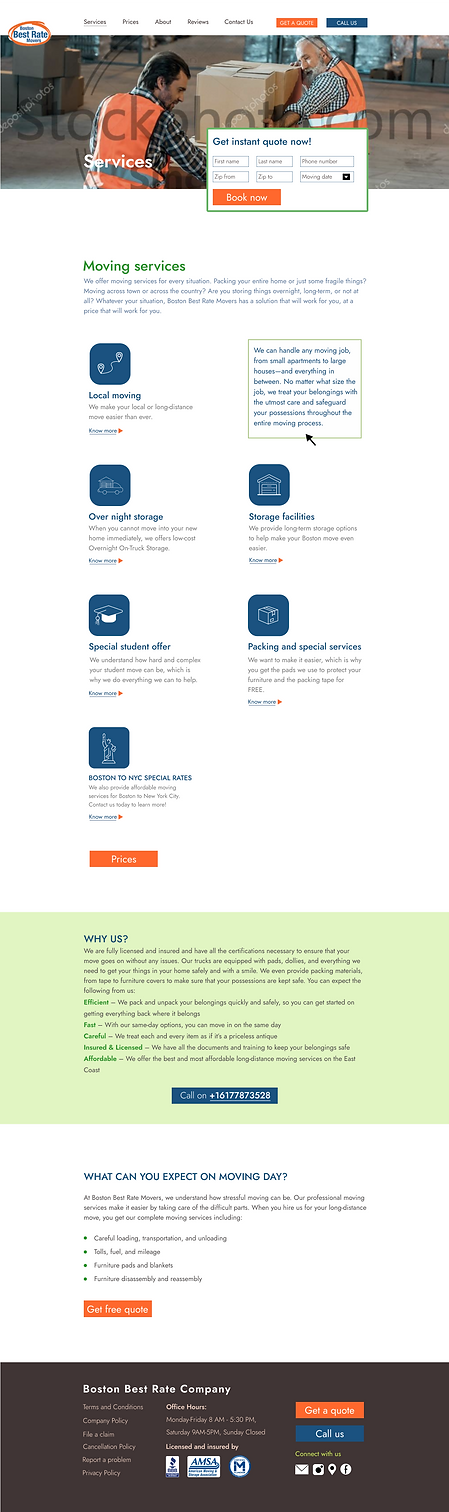
Icons represent the services, and clicking them flips to reveal detailed information, making interactions engaging and user-friendly.
<
____________
Giving them a brief explanation and showing them the values the company carry for their services.
<
_________
Sharing the insights of the moving day so that the user know what to expect and by adding CTA's in the end
Prices page
Mobile

Desktop
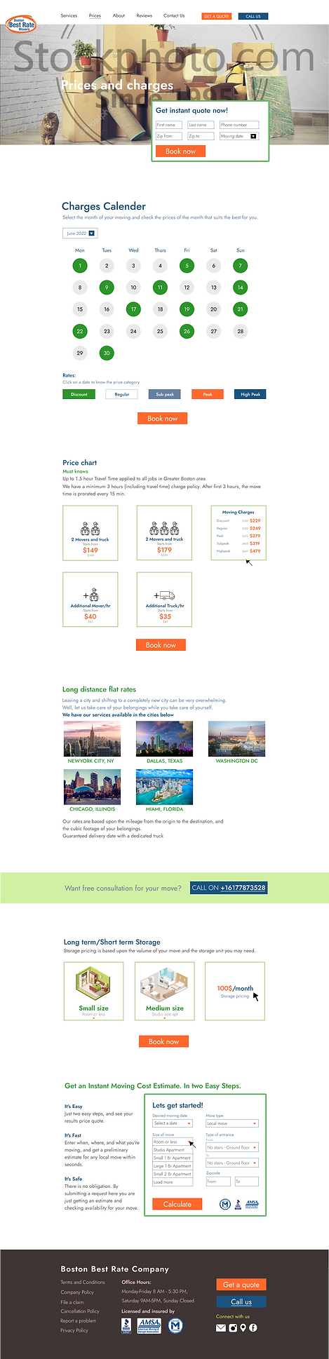
Created a calender for the user to know which date would be the most suitable for them given the rates on each date.
<
____________
A price chart to make them understand the pricing and rates of all the services in a smooth way by adding icons and illustrations.
<
_________
By adding pictures of the cities they give services to makes it easier for the user to recognize the places
Illustration showing the different units of the storage pricing
A small CTA form to get a quote instantly just by filling this form.
About page
Mobile

Desktop
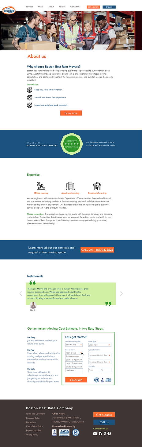
To share about the company , the first section talks about the mission of the company.
The company outlines their service guarantee, followed by information about their areas of expertise and company details.
A testimonial to show how the previous customers loved the services given by Boston Best Rate Movers
Reviews page
Mobile

Desktop
Contact page
Mobile
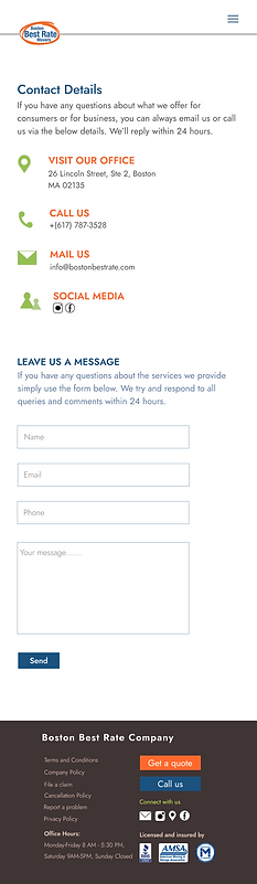
Desktop
